|
During this unit, I think that I have learned a lot of useful things about typography. Typography is "the visual component of the written word". In other words, typography is basically how you take a word or phrase and design it so that it suits whatever word/phrase it is representing. Typography is important because when it comes to having visual appeal, the book will 100% be judged by the cover. For example, if a movie poster is being promoted, then depending on how interesting the poster is, people may or may not want to watch it. "Each font has a personality and a purpose." To me, I think this quote means that every type of typography can convey a different message. All people are different and possess different characteristics. So, just like us, fonts have different personalities and serve a different purpose, whether it be for a poster or a billboard. Serif Serif fonts have "feet" at the ends of each letter. They are usually used in big blocks of text and in print. Sans Serif Sans Serif fonts are the exact opposite of serif fonts. They do not have "feet" at the ends. The are also most commonly used in headlines, titles, and other smaller chunks of text as well as on the web. Monospaced With monospace fonts, each letter will take up the same exact amount of space. They do not work very well with larger blocks of text and are most commonly used in coding. Script/Handwritten Script fonts are usually in some form of cursive, calligraphy, or handwriting. These fonts can often be hard to read, but are used mostly for logos, large headlines, and details. Display Display fonts are especially good at grabbing people's attention. They are usually unique, and sometimes even bold. However, when utilizing this font, it should be used sparingly, as the popularity for display fonts come and go. Typeface ComparisonFor this activity, I was asked to take five different fonts from the five different typeface categories and display them. Based on this, you can see all of the differences between the fonts, and can get a general idea of how you should utilize these fonts. 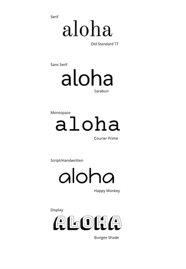 Word PortraitsFor this assignment, it was almost like I was painting a picture with words. Different fonts resemble different feelings and words. So for this assignment, I took fonts and wrote down the word the font reminded me of. Then, using the same exact font, I wrote down a word that did not convey what the font resembled. 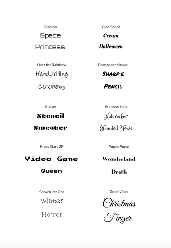
0 Comments
Leave a Reply. |
Archives
January 2021
Categories
All
 This work is licensed under a Creative Commons Attribution-NonCommercial-NoDerivatives 4.0 International License. |
