|
For this final summative assignment, I was asked to create an original logo for any brand, shop, product, company. During this creation process, the main tools I utilized were the pen tool and line function. I created a lot of outlines in order to create crystals using basic shapes, so those two tools were the most practical for me during this process. The most frustrating/challenging aspect of creating my logo was coming up ideas for the logo itself. I had some very basic ideas in my head, but when I drew them onto Gravit, they didn't look as good as I had initially expected and I ended up scrapping two designs before I settled on creating a simple design for a shop. I overcame my challenges by referring back to student projects from previous years and using that as inspiration to think about which basic shapes I could use in my project to make a simple, yet slightly "complicated" design. My final design was as close as I could get to this, and though I definitely could have paid more attention to smaller aspects, I tried my best to embody my brand through the logo. 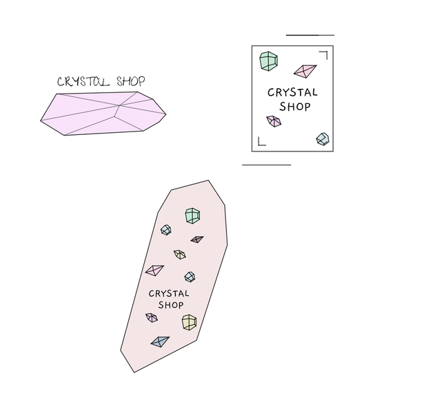 The name of my "brand", or shop is simply the "Crystal Shop". The purpose of my shop is to provide people with unique crystals that suit and are made for them. The logo represents my brand because crystals are the main thing that we are selling. However, the overall layout of the logo also represents the brand because the inside of our shop and each crystal has a simple, yet elegant tone, which is what I aimed for when creating the logo. This is also the reason why I chose this logo. The second version (the one I chose) of the logo I created seemed like it embodied the mood of my shop more. When choosing/creating a logo, I believe that it is important to try your best to squeeze in the theme/mood of a store, brand, company, ect. to appeal to the people who see it so that they become interested in what you are advertising. 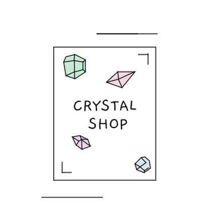
0 Comments
This past unit was all about colors, how we see colors, and how colors are formatted (hex code, RGB values). Two assignments we had to do were all about color names and color schemes. For the color names, we had to choose a palette of colors, find their HEX code and RGB value, then paste it into Gravit. The color schemes assignment was similar to this. We learned about four different types of color combinations (monochromatic, analogous, complementary, triad). Using Adobe Color, we were able to create these color palettes. I then used the colors and put them into a basic format in Gravit to show how these types of combinations looked. While creating these two palettes, I ran into come challenges making sure that some colors didn't overlap and that everything looked pleasing to the eye. Especially with the color schemes, putting together colors that were on opposite sides of the color wheel and making it look presentable was a challenge, but it seemed to work out in the end after lots of experimenting. Color Names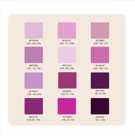 Color Schemes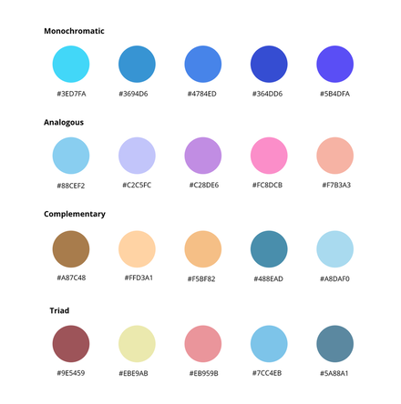 During this unit, I think that I have learned a lot of useful things about typography. Typography is "the visual component of the written word". In other words, typography is basically how you take a word or phrase and design it so that it suits whatever word/phrase it is representing. Typography is important because when it comes to having visual appeal, the book will 100% be judged by the cover. For example, if a movie poster is being promoted, then depending on how interesting the poster is, people may or may not want to watch it. "Each font has a personality and a purpose." To me, I think this quote means that every type of typography can convey a different message. All people are different and possess different characteristics. So, just like us, fonts have different personalities and serve a different purpose, whether it be for a poster or a billboard. Serif Serif fonts have "feet" at the ends of each letter. They are usually used in big blocks of text and in print. Sans Serif Sans Serif fonts are the exact opposite of serif fonts. They do not have "feet" at the ends. The are also most commonly used in headlines, titles, and other smaller chunks of text as well as on the web. Monospaced With monospace fonts, each letter will take up the same exact amount of space. They do not work very well with larger blocks of text and are most commonly used in coding. Script/Handwritten Script fonts are usually in some form of cursive, calligraphy, or handwriting. These fonts can often be hard to read, but are used mostly for logos, large headlines, and details. Display Display fonts are especially good at grabbing people's attention. They are usually unique, and sometimes even bold. However, when utilizing this font, it should be used sparingly, as the popularity for display fonts come and go. Typeface ComparisonFor this activity, I was asked to take five different fonts from the five different typeface categories and display them. Based on this, you can see all of the differences between the fonts, and can get a general idea of how you should utilize these fonts. 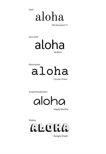 Word PortraitsFor this assignment, it was almost like I was painting a picture with words. Different fonts resemble different feelings and words. So for this assignment, I took fonts and wrote down the word the font reminded me of. Then, using the same exact font, I wrote down a word that did not convey what the font resembled. 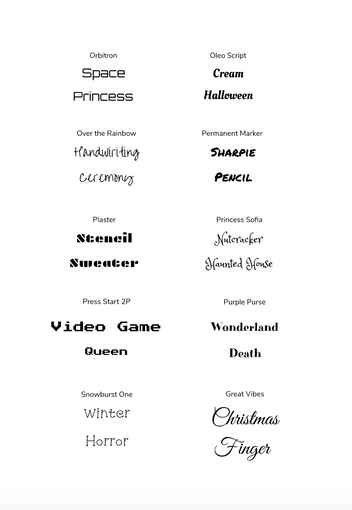 In this unit, I was assigned to do several things with the pen tool. Specifically cutting out and tracing images. The Pen Tool is essentially a tool in Gravit that allows you to do a lot of different things with images. Like stated before, it has the ability to cut out and trace images so that you can alter and color them to your liking. For my actual summative however, I created a mini collage. The outcome wasn't as busy and filled with images as I expected it to be, but I was still able to cut out images and put them together to create a final product. I just pieced together some images I was able to find on Pinterest, and used the word "imagine". This is the link to my image sources (this doc also includes the links to my images for the composite image) document. While creating my final collage, I ran into quite a few problems. Firstly, in order to make it look like the image of the bears wasn't so "choppy", I had to re-do the image a couple of times in order to get a pretty good outline with the pen tool. Other than that, the pen tool wasn't too hard to use for my project, but I did run into some issues when it came to the overall layout of the collage. Overall, I think that using the pen tool was a very positive experience. I learned a lot, and was able to come up with a decent "product" in the end for my summative. My Summative Image: 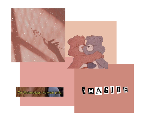 My 3 Exercises:  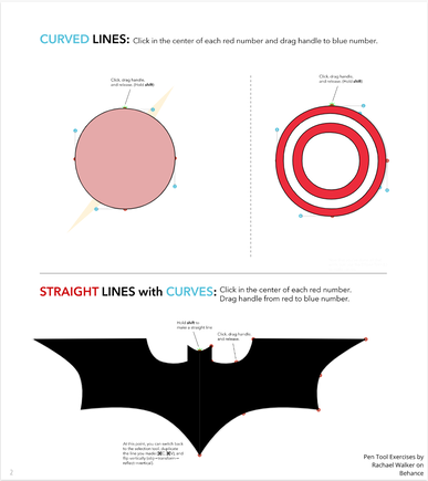 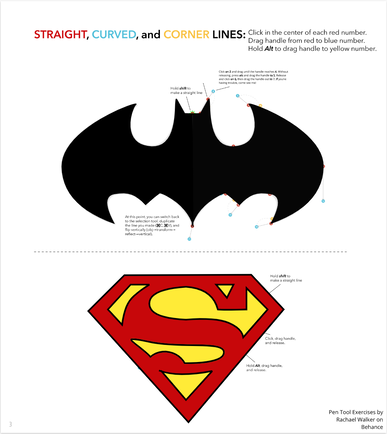 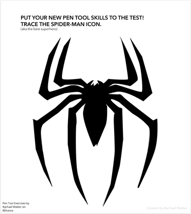   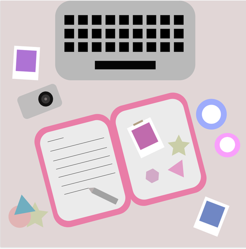 This was the picture I created for the Summative project. This photo is meaningful to me in a lot of ways. This photo would be showing the things I love on my desk. I tend to spend a ton of time at my desk doing a lot of different things, so this photo shows all of the things I love scattered on top of my desk. I enjoy writing/journaling, so I have a journal. I love taking photos as well, so I have the camera and some other pieces of film. And finally, I have my computer that I use to do my homework, listen to music, watch movies, ect.
For this lesson, I experimented a ton with modifying and transforming shapes. It was a lot of fun, and allowed for a lot of creativity. 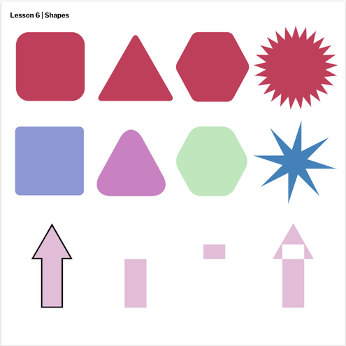 For this lesson, a learned how to layer images through keyboard shortcuts. For example, I learned how to put one image all the way at the bottom, or all the way at the top to create a gradient. In addition to this, I learned to align things in the bottom, center and middle. 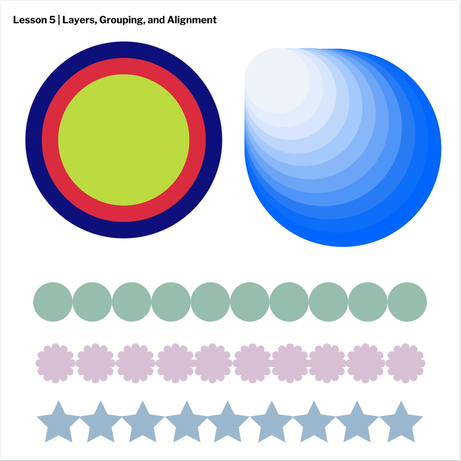 For this lesson, I did a ton of experimenting with colors and different types of borders. It was very enjoyable and fun to experiment with. 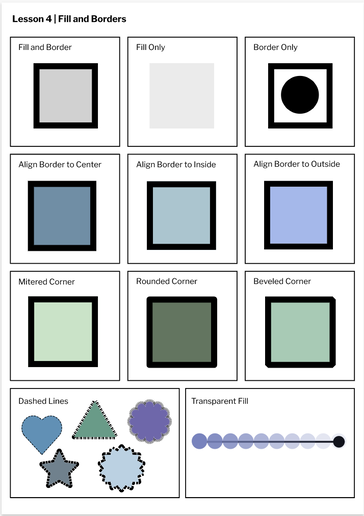 For this assignment, I experimented a lot with creating shapes, altering shapes, rotating images, and changing colors. I feel like a learned a lot from this lesson, and hope to apply it later on. 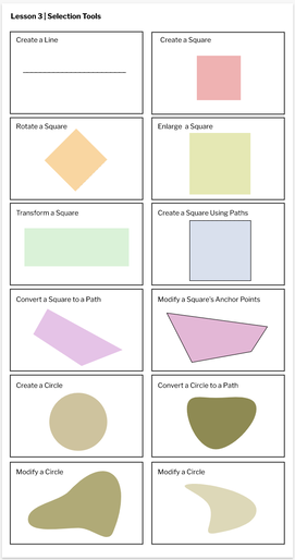 For this assignment, I used Gravit to experiment with different paper shapes, sizes, colors, and fonts. I think I learned a ton from this assignment, from how to make custom pages to experimenting with different styles so I can find what I enjoy doing. 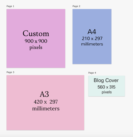 |
Archives
January 2021
Categories
All
 This work is licensed under a Creative Commons Attribution-NonCommercial-NoDerivatives 4.0 International License. |
